Settings Components
Building a settings UI can be repetitive. Xed-Editor provides a collection of pre-made components that match the app's look and feel while reducing the amount of code you need to write.
Base Components
These are low-level components used to structure your settings layout.
PreferenceLayout
The top-level container for any settings screen. It handles the scrolling and the top app bar.
PreferenceLayout(label = "My settings", backArrowVisible = true) {
    // Content goes here
}
PreferenceGroup
Groups related settings together with an optional heading. It also adds a nice background around the items.
PreferenceGroup(heading = "Appearance") {
    // Settings items go here
}
PreferenceTemplate
A generic template for creating custom settings items. It provides slots for icons, titles, and descriptions. You should only use this if the other components don't fit your needs.
Common Components
These components provide more functionality with less boilerplate and are used throughout the app.
SettingsItem
This is the most versatile component. It can be a clickable item or a toggle switch.
SettingsItem(
    label = "Enable advanced mode",
    description = "Shows more options in the menu",
    default = MySettings.advancedMode,
    sideEffect = { MySettings.advancedMode = it }
)
If you set showSwitch = false, it becomes a simple clickable item:
SettingsItem(
    label = "Clear cache",
    description = "Remove all cached files",
    showSwitch = false,
    onClick = { /* Clear logic */ }
)
EditorSettingsItem
A specialized version of SettingsItem that automatically refreshes the editor when the value changes. Use this for anything that affects the code editor's appearance or behavior.
EditorSettingsItem(
    label = "Show line numbers",
    default = MySettings.showLineNumbers,
    sideEffect = { MySettings.showLineNumbers = it }
)
InfoBlock
Displays a highlighted block of information or a warning. It's great for explaining complex settings or giving tips.
InfoBlock(
    text = "The following settings are experimental.",
    warning = true,
    icon = { Icon(Icons.Default.Warning, null) }
)
NextScreenCard
A card that navigates to another settings screen when clicked. It automatically adds a "chevron"icon at the end to indicate navigation.
NextScreenCard(
    label = "Editor font",
    description = "Change the font used in the code editor",
    route = "font_settings",
)
PreferenceList
Shows a Settings item that opens a dialog with a list of options. The user can select exactly one item.
The items argument should be a list of pairs, where the first element is the value that will be used to call onItemSelected and the second element is the text that will be displayed in the list.
PreferenceList(
    label = "Line ending",
    description = "Change the line ending used in files",
    items = listOf("LF" to "LF (Unix)", "CRLF" to "CRLF (Windows)", "CR" to "CR (Mac)"),
    selectedItem = MySettings.lineEnding,
    onItemSelected = { MySettings.lineEnding = it }
)
PreferenceSingleInput
Shows a Settings item that opens a dialog with a single text input field. Perfect for names, URLs, or other short strings.
PreferenceSingleInput(
    label = "Author name",
    description = "The name shown in your commits",
    value = MySettings.author,
    onConfirm = { MySettings.author = it },
    validate = { it.isNotBlank() },
    // ...
)
SingleInputDialog / DoubleInputDialog
SingleInputDialog is internally used by PreferenceSingleInput. In most cases you should use it instead because it is more convenient.
The DoubleInputDialog is a variant of the SingleInputDialog that asks for two values at once. There is no convenient PreferenceDoubleInput, therefore you have to manually create this dialog:
DoubleInputDialog(
    title = "Server configuration",
    firstInputLabel = "Host",
    firstInputValue = host,
    onFirstInputValueChange = { host = it },
    secondInputLabel = "Port",
    secondInputValue = port,
    onSecondInputValueChange = { port = it },
    onConfirm = { /* Save logic */ }
)
These two dialogs have many more options than shown here, like showing error messages or changing the button text.
Value Sliders
Sliders are perfect for numeric settings like font size or opacity. Xed-Editor provides three specialized variants to handle different behaviors.
SmoothValueSlider
A standard slider that will behave continuously between the minimum and maximum values. Use this for settings that have a high range of values.
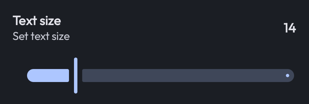
SmoothValueSlider(
    label = "Text size",
    description = "Set text size",
    min = 6,
    max = 50,
    default = MySettings.fontSize,
    onValueChanged = { MySettings.fontSize = it }
)
SteppedValueSlider
Moves in discrete steps. This is useful when you want to restrict the user to specific values (e.g., only even numbers).
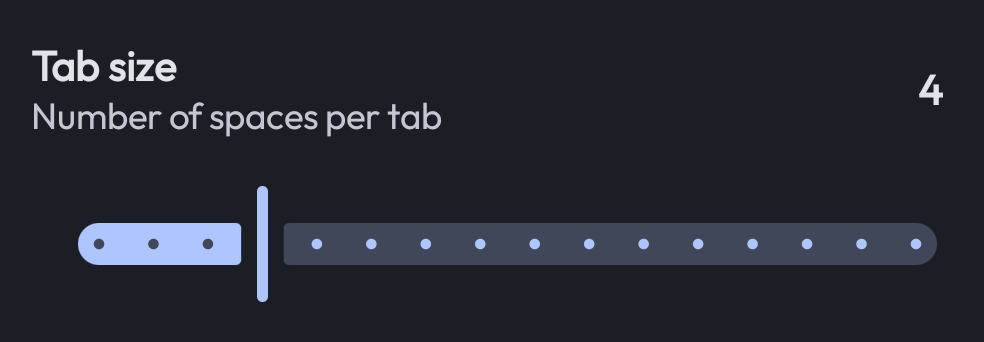
SteppedValueSlider(
    label = "Tab size",
    description = "Number of spaces per tab",
    min = 1,
    max = 16,
    stepSize = 1,
    default = MySettings.tabSize,
    onValueChanged = { MySettings.tabSize = it }
)
RoundedValueSlider
Similar to the stepped slider, but it automatically rounds the minimum value down to a clean power-of-10 boundary. This creates a "cleaner" visual scale when working with large ranges that can't be represented linearly.
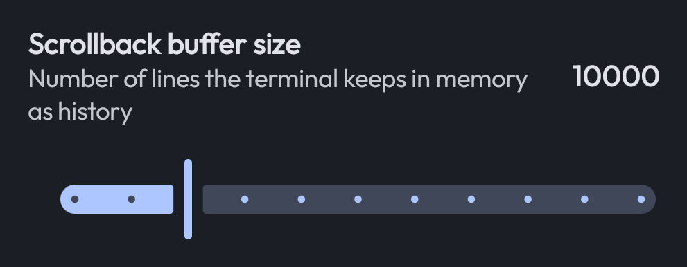
RoundedValueSlider(
    label = "Scrollback buffer size",
    description = "Number of lines the terminal keeps in memory as history",
    min = 100,
    max = 50_000,
    stepSize = 5_000,
    default = MySettings.scrollbackSize,
    onValueChanged = { MySettings.scrollbackSize = it }
)
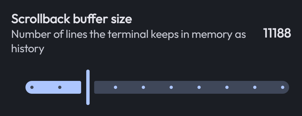
When we would've used the SteppedValueSlider for the above example, fraction numbers would have been visible:
TIP
All sliders include a "debounce" feature, meaning the onValueChanged callback is only triggered after the user stops moving the slider for a short moment. This prevents lag when saving settings to disk.