Themes
Themes in Xed-Editor allow you to customize the look and feel of the user interface.
A theme always consists of light and dark color schemes that style the UI of the application, editor and terminal.
Built-in Themes
Xed-Editor comes with a small set of pre-installed themes that you can use immediately without any configuration.
- Blueberry theme (Default) – blue-based color palette
- Lime theme – green-based color palette
AMOLED Mode
AMOLED mode is available for all themes.
When enabled, it replaces the background surfaces with pure black backgrounds. This is mainly useful for OLED displays to reduce power consumption and improve contrast.
Dynamic Theming (Monet)
Xed-Editor supports dynamic colors, also known as Monet.
On supported Android versions (Android 12 and above), the system can generate a complete color scheme based on your device wallpaper.
When enabled, the editor will automatically derive its theme colors from the system dynamic palette instead of using a manually defined theme.
You can enable this feature in:
Settings → Appearance → Use dynamic colors
INFO
When dynamic colors are enabled the active theme is replaced with the Monet-based palette. This means you either use a custom theme or rely on dynamic system theming, but not both at the same time.
Installing Themes
A theme is distributed as a .xed package (a ZIP file) that contains the color palette and package metadata. You can install it by going to Settings → Store → Install from storage and selecting the .xed package from storage.
In addition, themes can also be installed directly from the extension marketplace inside the settings.
Creating Custom Themes
Because Xed-Editor is built with Material 3 design principles in mind, theme creation follows a structure similar to Material You (Material 3) theming.
TIP
Instead of creating a theme from scratch, you can use the Theme-Template repository as a starting point.
A theme package consists of two separate JSON files:
manifest.json– defines the package metadata (e.g.id,name,version)theme.json– defines the color palettes for light and dark mode
{
  "$schema": "https://raw.githubusercontent.com/Xed-Editor/Xed-Schemas/main/theme-manifest.json",
  "id": "com.demo.my_theme",
  "name": "My Theme",
  "version": "1.0.0",
  "type": "theme",
  "author": {
    "displayName": "Unknown"
  },
  "repository": "https://github.com/you/my-theme",
  "license": "MIT",
  "tags": [],
  "minAppVersion": 87,
  "inheritBase": true
}{
"$schema": "https://raw.githubusercontent.com/Xed-Editor/Xed-Schemas/main/theme.json",
"light": {},
"dark": {}
}Manifest Properties
| Property | Type | Required | Description |
|---|---|---|---|
id | string | Yes | Unique identifier for the theme |
name | string | Yes | Display name for the theme |
version | string | No | Version number (like 1.0.0) |
type | string | No | Package type, always theme for themes |
author | object | No | Contains displayName and optional github handle |
repository | string | No | URL to your source code repository |
license | string | No | The license for your code (e.g., MIT) |
tags | string[] | No | Keywords to help users find your theme |
minAppVersion | integer | null | No (default: null) | Minimum Xed-Editor version code supported. null means no minimum restriction |
inheritBase | boolean | No (default: true) | Whether to inherit tokenColors from base theme |
NOTE
All properties are case-sensitive. Make sure to use the correct casing when defining properties.
NOTE
The base theme is the default Xed-Editor theme that ships with the application, it's called blueberry.
Base Inheritance
If inheritBase is set to true, the theme will inherit the tokenColors from the base theme if they are not defined in the custom theme. That means all properties defined in the custom theme will override the base theme's properties, while any missing properties will fall back to the base theme's values. If inheritBase is set to false, the theme will only use the properties defined in the custom theme. This means any missing syntax element colors will not have a fallback so they will not be distinguishable from other syntax elements.
Color Palettes
Each of the light and dark objects can contain the following color categories:
| Category | Type | Description |
|---|---|---|
baseColors | object | Colors for the user interface of the app |
editorColors | object | Colors for the user interface of the editor |
terminalColors | object | Colors for the integrated terminal |
tokenColors | object | array | Syntax highlighting colors for the editor |
You can read more about each category in the API Reference section.
You can omit optional fields. If a field is missing, the base theme's value will be used as a fallback. This applies to all colors in the theme file except for tokenColors if inheritBase is set to false (Base inheritance).
Building the Theme Package
Once you have defined the color palettes in theme.json and the metadata in manifest.json, you can build the .xed package.
The Theme-Template repository ships with a build script. If you have Node.js installed, run:
node build.jsThis produces the package at output/<id>.xed.
This .xed file can be installed locally or uploaded when publishing your theme.
API Reference
This section provides detailed information about each color category and its properties.
baseColors
Defines colors for the user interface of the application. As Xed-Editor follows the Material You design guidelines, these colors are based on the Material Design color system (https://m3.material.io/styles/color/roles). The values have to be in the standard Android hex color format (#RRGGBB or #AARRGGBB). Optionally color names can be used (e.g., red, blue, etc.).
| Property | Type | Description | Usage example |
|---|---|---|---|
primary | string | Primary color used in the UI | Active tab |
onPrimary | string | Color used for text/icons on primary color | Currently not used |
primaryContainer | string | Container color for primary color | Active terminal session background in drawer |
onPrimaryContainer | string | Color used for text/icons on primary container | Active terminal session foreground in drawer |
secondary | string | Secondary color used in the UI | File icons in drawer |
onSecondary | string | Color used for text/icons on secondary color | Currently not used |
secondaryContainer | string | Container color for secondary color | Currently not used |
onSecondaryContainer | string | Color used for text/icons on secondary container | Currently not used |
tertiary | string | Tertiary color used in the UI | Currently not used |
onTertiary | string | Color used for text/icons on tertiary color | Currently not used |
tertiaryContainer | string | Container color for tertiary color | Currently not used |
onTertiaryContainer | string | Color used for text/icons on tertiary | Currently not used |
error | string | Color used for error messages | Error message below input field |
onError | string | Color used for text/icons on error color | Currently not used |
errorContainer | string | Container color for error color | Currently not used |
onErrorContainer | string | Color used for text/icons on error container | Currently not used |
background | string | Background color of the application | Settings or terminal background |
onBackground | string | Color used for text/icons on background | Settings title |
surface | string | Surface color for UI elements | Toolbar |
onSurface | string | Color used for text/icons on surface color | File name in drawer or terminal default text |
surfaceVariant | string | Variant surface color for UI elements | Dragged tab background |
onSurfaceVariant | string | Color used for text/icons on surface variant | Toolbar actions or settings subtitle |
outline | string | Color used for outlines | Currently not used |
outlineVariant | string | Variant outline color | Dividers in editor and settings |
inverseSurface | string | Inverse surface color for UI elements | Currently not used |
inverseOnSurface | string | Color used for text/icons on inverse surface | Currently not used |
inversePrimary | string | Inverse primary color used in the UI | Currently not used |
surfaceTint | string | Tint color for surfaces | Currently not used |
surfaceDim | string | Dimmed surface color for UI elements | Currently not used |
surfaceBright | string | Brightened surface color for UI elements | Currently not used |
surfaceContainerLowest | string | Lowest container surface color | Currently not used |
surfaceContainerLow | string | Low container surface color | Currently not used |
surfaceContainer | string | Container surface color | Dropdown menu |
surfaceContainerHigh | string | High container surface color | Currently not used |
surfaceContainerHighest | string | Highest container surface color | Currently not used |
scrim | string | Color used for scrims | Currently not used |
editorColors
Defines colors for the user interface of the text editor. The values have to be in the standard Android hex color format (#RRGGBB or #AARRGGBB). Optionally color names can be used (e.g., red, blue, etc.).
| Property | Type | Description |
|---|---|---|
problem_typo | string | Color for text marked as a typo |
problem_warning | string | Color for warnings in editor |
problem_error | string | Color for errors in editor |
sticky_scroll_divider | string | Color of sticky scroll divider |
strikethrough | string | Color for strikethrough text |
strike_through | string | old property for strikethrough (Deprecated) |
diagnostic_tooltip_action | string | Color of action buttons in diagnostic tooltips |
diagnostic_tooltip_detailed_msg | string | Color for detailed messages in diagnostic tooltips |
diagnostic_tooltip_brief_msg | string | Color for brief messages in diagnostic tooltips |
diagnostic_tooltip_background | string | Background color of diagnostic tooltips |
function_char_background_stroke | string | Stroke color for function character background |
hard_wrap_marker | string | Color for hard wrap markers |
text_inlay_hint_foreground | string | Foreground color of inlay hints |
text_inlay_hint_background | string | Background color of inlay hints |
snippet_background_editing | string | Background for editable snippet areas |
snippet_background_related | string | Background for related snippet areas |
snippet_background_inactive | string | Background for inactive snippet areas |
side_block_line | string | Color of side block lines |
non_printable_char | string | Color of non-printable characters |
text_selected | string | Foreground color for selected text |
matched_text_background | string | Background for matched text |
matched_text_border | string | Border for matched text |
completion_wnd_corner | string | Color of completion window corners |
completion_wnd_background | string | Background color of completion window |
completion_wnd_text_matched | string | Color for matched text in completion window |
completion_wnd_text_primary | string | Primary text color in completion window |
completion_wnd_text_secondary | string | Secondary text color in completion window |
completion_wnd_item_current | string | Background color of current item in completion window |
line_block_label | string | color for line block label (Deprecated) |
text_highlight_strong_background | string | Background for strong highlights |
text_highlight_strong_border | string | Border for strong highlights |
text_highlight_background | string | Background for normal highlights |
text_highlight_border | string | Border for normal highlights |
highlighted_delimiters_background | string | Background color for highlighted delimiters |
highlighted_delimiters_underline | string | Underline color for highlighted delimiters |
highlighted_delimiters_foreground | string | Foreground color for highlighted delimiters |
highlighted_delimiters_border | string | Border color for highlighted delimiters |
line_number_panel_text | string | Text color for line number panel |
line_number_panel | string | Background for line number panel |
block_line_current | string | Color for the current block line |
block_line | string | Color for non-current block lines |
scroll_bar_track | string | Color of scroll bar track |
scroll_bar_thumb_pressed | string | Color of pressed scroll bar thumb |
scroll_bar_thumb | string | Color of scroll bar thumb |
underline | string | Color for underlined text |
current_line | string | Background for current line |
current_row_border | string | Border for current row |
selection_handle | string | Color of selection handle |
selection_insert | string | Color for insertion point |
selected_text_background | string | Background for selected text |
selected_text_border | string | Border for selected text |
text_normal | string | Default text color |
whole_background | string | Background color of editor |
line_number_background | string | Background for line numbers |
line_number_current | string | Background for current line number |
line_number | string | Text color for line numbers |
line_divider | string | Color for line dividers |
signature_text_normal | string | Default color for signature text |
signature_text_highlighted_parameter | string | Highlight color for signature parameters |
hover_text_normal | string | Normal text color in hover tooltip |
hover_text_highlighted | string | Highlighted text in hover tooltip |
hover_background | string | Background of hover tooltip |
hover_border | string | Border of hover tooltip |
static_span_background | string | Background for static spans |
static_span_foreground | string | Foreground for static spans |
signature_background | string | Background for signature blocks |
signature_border | string | Border for signature blocks |
text_action_window_background | string | Background for text action window |
text_action_window_icon_color | string | Icon color for text action window |
attribute_value | string | old property for attribute value (Deprecated) |
attribute_name | string | old property for attribute name (Deprecated) |
html_tag | string | old property for HTML tags (Deprecated) |
annotation | string | old property for annotations (Deprecated) |
function_name | string | old property for function names (Deprecated) |
identifier_name | string | old property for identifier names (Deprecated) |
identifier_var | string | old property for identifier variables (Deprecated) |
literal | string | old property for literals (Deprecated) |
operator | string | old property for operators (Deprecated) |
comment | string | old property for comments (Deprecated) |
keyword | string | old property for keywords (Deprecated) |
terminalColors
Defines colors for the integrated terminal.
| Property | Type | Description | Usage example |
|---|---|---|---|
foreground | string | NOTE: Please use baseColors.onSurface instead. | Currently not used |
background | string | NOTE: Please use baseColors.background instead. | Currently not used |
cursor | string | Color of the terminal cursor | Terminal cursor |
color0 | string | Color for ANSI color 0 (black) | ANSI black color |
color1 | string | Color for ANSI color 1 (red) | ANSI red color |
color2 | string | Color for ANSI color 2 (green) | ANSI green color |
color3 | string | Color for ANSI color 3 (yellow) | ANSI yellow color |
color4 | string | Color for ANSI color 4 (blue) | ANSI blue color |
color5 | string | Color for ANSI color 5 (magenta) | ANSI magenta color |
color6 | string | Color for ANSI color 6 (cyan) | ANSI cyan color |
color7 | string | Color for ANSI color 7 (white) | ANSI white color |
color8 | string | Color for ANSI color 8 (bright black) | ANSI bright black color |
color9 | string | Color for ANSI color 9 (bright red) | ANSI bright red color |
color10 | string | Color for ANSI color 10 (bright green) | ANSI bright green color |
color11 | string | Color for ANSI color 11 (bright yellow) | ANSI bright yellow color |
color12 | string | Color for ANSI color 12 (bright blue) | ANSI bright blue color |
color13 | string | Color for ANSI color 13 (bright magenta) | ANSI bright magenta color |
color14 | string | Color for ANSI color 14 (bright cyan) | ANSI bright cyan color |
color15 | string | Color for ANSI color 15 (bright white) | ANSI bright white color |
color16 | string | Color for ANSI color 16 | ANSI extended colors |
color17 | string | Color for ANSI color 17 | ANSI extended colors |
color18 | string | Color for ANSI color 18 | ANSI extended colors |
color19 | string | Color for ANSI color 19 | ANSI extended colors |
color20 | string | Color for ANSI color 20 | ANSI extended colors |
color21 | string | Color for ANSI color 21 | ANSI extended colors |
WARNING
Terminal colors only support solid colors. The values have to be in the hex color format ( #RRGGBB).
NOTE
Some general colors of the terminal are defined in the baseColors category, such as the terminal background.
NOTE
Only the standard, intense and some extended ANSI colors can be customized. The customization range is limited to 0-21. The rest of the ANSI colors will use default values. 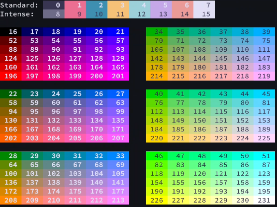
tokenColors
Defines syntax highlighting colors for the text editor. You can either define it as an object (for simple themes) or as an array of rules (for more complex themes).
As an Object
When defined as an object, you can specify colors for different syntax elements directly. This option allows you to define a mapping only from syntax elements to their corresponding foreground colors. Example:
"tokenColors": {
  "comment": "#6A9955",
  "string": "#CE9178",
  "keyword": "#569CD6",
  "function": "#DCDCAA"
}
The values have to be in the hex color format (#RRGGBB or #RRGGBBAA). Optionally color names can be used (e.g., red, blue, etc.).
As an Array (TextMate-style)
When defined as an array, you can create more complex rules for syntax highlighting. This option follows the TextMate grammar conventions (https://manual.macromates.com/en/language_grammars). Example:
"tokenColors": [
  {
    "scope": "comment",
    "settings": {
      "foreground": "#6A9955",
      "fontStyle": "italic"
    }
  },
  {
    "scope": "string",
    "settings": {
      "foreground": "#CE9178"
    }
  }
]
The scope property defines which syntax elements the rule applies to, and the settings property contains the color settings for that scope. Colors values have to be in the hex color format ( #RRGGBB or #RRGGBBAA). Optionally color names can be used (e.g., red, blue, etc.).
Publish a Theme
Publishing a theme works in a very similar way to publishing an extension.
First, you need to create an account on https://xed-editor.app.
Once you are signed in, There you will find a Publish button. Click it and upload your theme by dragging and dropping the built .xed package into the upload area.
Once uploaded, your theme will appear in the extension marketplace inside the editor. From there, users can browse and install it like any other extension.
Updating a theme follows the same rule as extensions. You just upload a new .xed package with an increased version number in manifest.json while keeping the same ID. This ensures that users can receive updates automatically without needing to reinstall anything manually.